Show code
eu_countries |>
  tidyplot(x = area, y = population) |>
  add_reference_lines(x = 2.5e5, y = 30) |>
  add_data_points(white_border = TRUE)
![]()
eu_countries |>
tidyplot(x = area, y = population) |>
add_reference_lines(x = 2.5e5, y = 30) |>
add_data_points(white_border = TRUE)
energy |>
  dplyr::filter(year >= 2008) |>
  tidyplot(x = year, y = energy, color = energy_source) |>
  add_barstack_relative()
study |>
  tidyplot(x = treatment, y = score, color = treatment) |>
  add_mean_dot(size = 2.5) |>
  add_mean_bar(width = 0.03) |>
  add_mean_value()
study |>
  tidyplot(x = treatment, y = score, color = treatment) |>
  add_boxplot() |>
  add_data_points_beeswarm()
study |>
  tidyplot(x = group, y = score, color = dose) |>
  add_mean_bar(alpha = 0.3) |>
  add_sem_errorbar() |>
  add_data_points() |>
  add_test_asterisks(hide_info = TRUE)
time_course |>
  tidyplot(x = day, y = score, color = treatment, dodge_width = 0) |>
  add_mean_line() |>
  add_sem_ribbon()
energy_week |>
  tidyplot(x = date, y = power, color = energy_source) |>
  add_areastack_absolute()
study |>
  tidyplot(x = treatment, y = score, color = treatment) |>
  add_violin() |>
  add_data_points_beeswarm()
energy |>
  tidyplot(y = energy, color = energy_source) |>
  add_donut()
climate |>
  tidyplot(x = month, y = max_temperature, dodge_width = 0) |>
  add_mean_line(group = year, alpha = 0.08) |>
  add_mean_line() |>
  adjust_x_axis(rotate_labels = 90)
study |>
  tidyplot(x = score, y = treatment, color = treatment) |>
  add_mean_bar(alpha = 0.3) |>
  add_sem_errorbar() |>
  add_data_points()
climate |>
  tidyplot(x = month, y = year, color = max_temperature) |>
  add_heatmap()
energy_week |>
  tidyplot(x = date, y = power, color = energy_source) |>
  add_areastack_relative()
time_course |>
  tidyplot(x = day, y = score, color = treatment, dodge_width = 0) |>
  add_mean_line() |>
  add_mean_dot(size = 1) |>
  add_sem_errorbar(width = 2)
energy |>
  dplyr::filter(year >= 2008) |>
  tidyplot(x = year, y = energy, color = energy_source) |>
  add_barstack_absolute()
energy |>
  tidyplot(x = energy, y = energy_source, color = energy_source) |>
  add_sum_bar() |>
  remove_legend()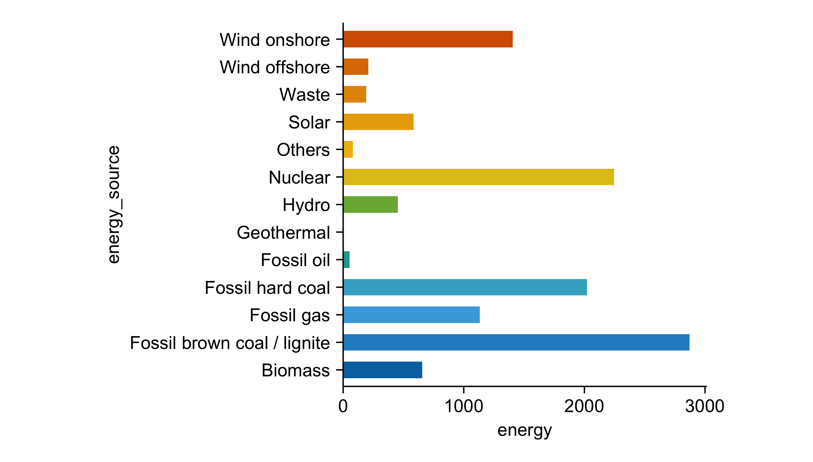
energy |>
  tidyplot(y = energy, color = energy_source) |>
  add_barstack_absolute()
energy |>
  tidyplot(y = energy, color = energy_source) |>
  add_pie()
energy |>
  tidyplot(y = energy, color = energy_source) |>
  add_donut()
energy |>
  tidyplot(x = year, y = energy, color = energy_source) |>
  add_barstack_absolute()
energy |>
  tidyplot(x = year, y = energy, color = energy_source) |>
  add_barstack_relative()
energy |>
  tidyplot(x = year, y = energy, color = energy_source) |>
  add_areastack_absolute()
energy |>
  tidyplot(x = year, y = energy, color = energy_source) |>
  add_areastack_relative()
library(tidyverse)
library(tidyplots)

df <-
  read_csv("https://tidyplots.org/data/differential-expression-analysis.csv") |>
  mutate(
    neg_log10_padj = -log10(padj),
    direction = if_else(log2FoldChange > 0, "up", "down", NA),
    candidate = abs(log2FoldChange) >= 1 & padj < 0.05
    )

df |>
  tidyplot(x = log2FoldChange, y = neg_log10_padj) |>
  add_data_points(data = filter_rows(!candidate),
                  color = "lightgrey", rasterize = TRUE) |>
  add_data_points(data = filter_rows(candidate, direction == "up"),
                  color = "#FF7777", alpha = 0.5) |>
  add_data_points(data = filter_rows(candidate, direction == "down"),
                  color = "#7DA8E6", alpha = 0.5) |>
  add_reference_lines(x = c(-1, 1), y = -log10(0.05)) |>
  add_data_labels_repel(data = min_rows(padj, 6, by = direction), label = external_gene_name,
                        color = "#000000", min.segment.length = 0, background = TRUE) |>
  adjust_x_axis_title("$Log[2]~fold~change$") |>
  adjust_y_axis_title("$-Log[10]~italic(P)~adjusted$")
library(tidyverse)
library(tidyplots)

df <-
  read_csv("https://tidyplots.org/data/pca-plot.csv")

df |>
  tidyplot(x = pc1, y = pc2, color = group) |>
  add_data_points(size = 1.3, white_border = TRUE) |>
  add_ellipse() |>
  adjust_x_axis_title(paste0("Component 1 (", round(df$pc1_var*100, digits = 1), "%)")) |>
  adjust_y_axis_title(paste0("Component 2 (", round(df$pc2_var*100, digits = 1), "%)")) |>
adjust_colors(colors_discrete_apple) |>
  adjust_legend_title("Group")
library(tidyverse)
library(tidyplots)

df <-
  read_csv("https://tidyplots.org/data/correlation-matrix.csv")

df |>
  tidyplot(x = x, y = y, color = correlation) |>
  add_heatmap() |>
  sort_x_axis_labels(order_x) |>
  sort_y_axis_labels(order_y) |>
  remove_x_axis() |>
  remove_y_axis() |>
  remove_legend_title() |>
  adjust_legend_position("right") |>
  adjust_colors(colors_continuous_inferno) |>
  adjust_theme_details(legend.key.height = unit(1, "null")) |>
  add_caption("Data source: Spellman PT, et al. 1998. Mol Biol Cell 9(12): 3273-97.")
library(tidyverse)
library(tidyplots)

df <-
  read_csv("https://tidyplots.org/data/microbiota.csv") |>
  mutate(genus = fct_inorder(genus),
         sample = fct_reorder(sample, top, .desc = TRUE))

df |>
  tidyplot(x = sample, y = rel_abundance, color = genus) |>
  add_areastack_absolute(alpha = 0.6) |>
  add_caption("Data source: Tamburini FB, et al. 2022. Nat Comm 13, 926.") |>
  adjust_theme_details(legend.key.height = unit(3.4, "mm")) |>
  adjust_theme_details(legend.key.width = unit(3.4, "mm")) |>
  adjust_x_axis_title("Sample") |>
  adjust_y_axis_title("Relative abundance") |>
  remove_x_axis_labels() |>
  remove_x_axis_ticks() |>
  remove_legend_title()
gene_expression |>
  tidyplot(x = sample, y = external_gene_name, color = expression) |>
  add_heatmap(scale = "row") |>
  adjust_size(height = 100) |>
  sort_y_axis_labels(direction, -padj) |>
  adjust_theme_details(legend.key.height = unit(1, "null")) |>
  adjust_legend_title("Row Z-score") |>
  remove_x_axis_title() |>
  remove_y_axis_title()
library(tidyverse)

gene_expression |>
  filter(external_gene_name %in% c("Apol6", "Col5a3", "Bsn", "Fam96b", "Mrps14", "Tma7")) |>
  tidyplot(x = sample_type, y = expression, color = condition) |>
  add_violin() |>
  add_data_points_beeswarm(white_border = TRUE) |>
  adjust_x_axis_title("") |>
  remove_legend() |>
  add_test_asterisks(hide_info = TRUE, bracket.nudge.y = 0.3) |>
  adjust_colors(colors_discrete_ibm) |>
  adjust_y_axis_title("Gene expression") |>
  adjust_size(width = 35, height = 25) |>
  split_plot(by = external_gene_name, ncol = 2)
library(tidyverse)
library(tidyplots)

df <- read_csv("https://tidyplots.org/data/sequencing-qc-STAR.csv")

my_colors <- c("Uniquely mapped" = "#437bb1",
               "Mapped to multiple loci" = "#7cb5ec",
               "Mapped to too many loci" = "#f7a35c",
               "Unmapped: too short" = "#b1084c",
               "Unmapped: other" = "#7f0000")

df |>
  tidyplot(x = reads, y = sample, color = category) |>
  add_barstack_absolute(reverse = TRUE) |>
  theme_minimal_x() |>
  adjust_size(70, 50) |>
  adjust_colors(my_colors) |>
  adjust_x_axis(title = "Number of reads", cut_short_scale = TRUE) |>
  reorder_color_labels(names(my_colors)) |>
  remove_legend_title() |>
  remove_y_axis_title()
library(tidyverse)
library(tidyplots)

df <- read_csv("https://tidyplots.org/data/sequencing-qc-STAR.csv")

my_colors <- c("Uniquely mapped" = "#437bb1",
               "Mapped to multiple loci" = "#7cb5ec",
               "Mapped to too many loci" = "#f7a35c",
               "Unmapped: too short" = "#b1084c",
               "Unmapped: other" = "#7f0000")

df |>
  tidyplot(x = reads, y = sample, color = category) |>
  add_barstack_relative(reverse = TRUE) |>
  theme_minimal_x() |>
  adjust_size(70, 50) |>
  adjust_colors(my_colors) |>
  adjust_x_axis(title = "Percentage of reads", labels = scales::percent) |>
  reorder_color_labels(names(my_colors)) |>
  remove_legend_title() |>
  remove_y_axis_title()
library(tidyverse)
library(tidyplots)

df <- read_csv("https://tidyplots.org/data/sequencing-qc-featureCounts.csv")

my_colors <- c("Assigned" = "#7cb5ec",
               "Unassigned_Ambiguity" = "#434348",
               "Unassigned_MultiMapping" = "#90ed7d",
               "Unassigned_NoFeatures" = "#f7a35c")

df |>
  tidyplot(x = reads, y = sample, color = category) |>
  add_barstack_absolute(reverse = TRUE) |>
  theme_minimal_x() |>
  adjust_size(70, 50) |>
  adjust_colors(my_colors) |>
  adjust_x_axis(title = "Number of reads", cut_short_scale = TRUE) |>
  reorder_color_labels(names(my_colors)) |>
  remove_legend_title() |>
  remove_y_axis_title()
library(tidyverse)
library(tidyplots)

df <- read_csv("https://tidyplots.org/data/sequencing-qc-featureCounts.csv")

my_colors <- c("Assigned" = "#7cb5ec",
               "Unassigned_Ambiguity" = "#434348",
               "Unassigned_MultiMapping" = "#90ed7d",
               "Unassigned_NoFeatures" = "#f7a35c")

df |>
  tidyplot(x = reads, y = sample, color = category) |>
  add_barstack_relative(reverse = TRUE) |>
  theme_minimal_x() |>
  adjust_size(70, 50) |>
  adjust_colors(my_colors) |>
  adjust_x_axis(title = "Percentage of reads", labels = scales::percent) |>
  reorder_color_labels(names(my_colors)) |>
  remove_legend_title() |>
  remove_y_axis_title()
library(tidyverse)
library(tidyplots)

df <-
  read_csv("https://tidyplots.org/data/sales-of-cigarettes-per-adult-per-day.csv") |>
  mutate(
    cigarettes = `Manufactured cigarettes sold per adult per day`,
    Entity = fct_relevel(Entity, "France", "Germany", "United States"),
    Entity = fct_rev(Entity)
    )

df |>
  tidyplot(x = Year, y = cigarettes, color = Entity) |>
  add_mean_line(linewidth = 0.5) |>
  add_title("Sales of cigarettes per adult per day") |>
  add_caption("Data source: Our World in Data") |>
  theme_minimal_y() |>
  adjust_y_axis(limits = c(0,11)) |>
  adjust_size(100, 50) |>
  adjust_colors(c(
    "France" = "#F6C54D",
    "Germany" = "#C02D45",
    "United States" = "#4DACD6"
    ), na.value = "lightgrey") |>
  adjust_legend_position("top") |>
  adjust_title(fontsize = 14) |>
  remove_legend_title() |>
  remove_y_axis_title()
library(tidyverse)
library(tidyplots)

df <-
  read_csv2("https://tidyplots.org/data/countries-democracies-autocracies.csv") |>
  pivot_longer(ends_with("acies"), names_to = "type", values_to = "number")

df |>
  tidyplot(x = Year, y = number, color = type) |>
  add_areastack_relative() |>
  add_title("Countries by system of government") |>
  add_caption("Data source: Our World in Data") |>
  theme_minimal_y() |>
  adjust_size(100, 50) |>
  adjust_colors(c(
    "Closed autocracies" = "#E2514E",
    "Electoral autocracies" = "#F1B075",
    "Electoral democracies" = "#8BB7C6",
    "Liberal democracies" = "#5C95C5")) |>
  adjust_title(fontsize = 14) |>
  adjust_legend_position("top") |>
  adjust_theme_details(legend.key.height = unit(2, "mm")) |>
  adjust_theme_details(legend.key.width = unit(2, "mm")) |>
  adjust_y_axis(labels = scales::percent) |>
  remove_legend_title() |>
  remove_y_axis_title()
library(tidyverse)
library(tidyplots)

df <-
  read_csv("https://tidyplots.org/data/electricity-generation-in-Germany.csv")

my_colors <- c("Renewable" = "#4FAE62",
               "Nuclear" = "#F6C54D",
               "Fossil" = "#CCCCCC",
               "Other" = "#888888")

df |>
  dplyr::filter(year %in% c(2003, 2013, 2023)) |>
  tidyplot(y = energy, color = energy_type) |>
  add_donut() |>
  add_title("Electricity generation in Germany") |>
  add_caption("Data source: energy-charts.info") |>
  adjust_colors(my_colors) |>
  reorder_color_labels(names(my_colors)) |>
  remove_legend_title() |>
  adjust_size(width = 35, height = 35) |>
  adjust_title(fontsize = 14) |>
  adjust_caption(fontsize = 6) |>
  adjust_legend_position("bottom") |>
  split_plot(by = year, ncol = 3)
library(tidyverse)
library(tidyplots)

df <-
  read_csv("https://tidyplots.org/data/electricity-generation-in-Germany.csv")

my_colors <- c("Renewable" = "#4FAE62",
               "Nuclear" = "#F6C54D",
               "Fossil" = "#CCCCCC",
               "Other" = "#888888")

df |>
  tidyplot(x = year, y = energy, color = energy_type) |>
  add_barstack_absolute() |>
  add_title("Electricity generation in Germany (TWh)") |>
  add_caption("Data source: energy-charts.info") |>
  theme_minimal_y() |>
  adjust_size(100, 50) |>
  adjust_colors(my_colors) |>
  adjust_legend_position("top") |>
  adjust_title(fontsize = 14) |>
  adjust_x_axis_title("Year") |>
  remove_legend_title() |>
  remove_y_axis_title()
library(tidyverse)
library(tidyplots)

countries <- c("France", "Germany", "United States", "China", "World", "Norway")

df <-
  read_csv("https://tidyplots.org/data/energy-use-per-person.csv") |>
  mutate(
    energy = `Primary energy consumption per capita (kWh/person)`
    ) |>
  filter(Entity %in% countries)

df |>
  tidyplot(x = Year, y = energy, color = Entity) |>
  add_mean_line(linewidth = 0.5) |>
  add_data_points(data = filter_rows(Year == 2023)) |>
  add_data_labels_repel(label = Entity, data = filter_rows(Year == 2023), background = TRUE, background_alpha = 1, nudge_x = 11, direction = "y", force_pull = 0, hjust = 0) |>
  add_title("Energy consumption per capita (kWh)") |>
  add_caption("Data source: Our World in Data") |>
  theme_minimal_y() |>
  adjust_padding(right = 0.07) |>
  adjust_y_axis(limits = c(0, 1.4e5), cut_short_scale = TRUE) |>
  adjust_size(100, 50) |>
  adjust_title(fontsize = 14) |>
  adjust_colors(colors_discrete_seaside) |>
  sort_color_labels() |>
  remove_legend() |>
  remove_y_axis_title()
Author, maintainer, copyright holder
Website | GitHub | CRAN | Documentation
Engler JB (2025). “Tidyplots empowers life scientists with easy code-based data visualization” iMeta. https://doi.org/10.1002/imt2.70018.
Copyright © 2026 Jan Broder Engler. All rights reserved.